UX Design
Journease
A personalized travel companion powered by AI
Research
Define + Ideate
Prototype
Testing
Hi Fi Mockups
Lessons Learned
Project Overview
Journease is a personalized travel companion that offers curated recommendations based on your use history and habits collected through other social platforms. Using the power of AI, this tool not only offers valuable insights and suggestions, but also adapts to your unique travel style, ensuring that every journey is specifically tailored to you!
There are many different mapping applications on the market, but each of them have a variety of issues and user complaints resulting in unhappy customers.
The Challenge
Our solution was to create a more personalized mapping application experience by integrating the top used features as well as AI technology to help curate and provide more accurate and individualized information ensuring happier users and more time spent on our app.
The Solution
My Role
UX/UI DesignerUX ResearcherTimeline
2 days during a Startup Weekend 2 weeks for mobile expansionTools
Figma, FigjamDouble Diamond Design Process
Discover
User Research
Competitive Analysis
We began our research by identifying our biggest competitors and looking at their strengths and weaknesses. By doing a competitive analysis we were able to better understand what was missing in the market and how we might be able to fill those gaps.
Google Maps
Strengths:
Extremely detailed and accurate maps, global coverage, extensive integration with Google services, and large user base for frequent updates and reviews.
Weaknesses:
Privacy concerns, occasional inaccuracies in less populated areas, can be overwhelming with information.
Apple Maps
Strengths:
Excellent privacy protection, smooth user experience within the Apple ecosystem, and clear, visually appealing maps.
Weaknesses:
Limited to Apple ecosystem, historically had accuracy issues, less comprehensive than Google Maps.
Bing Maps
Strengths:
Strong integration with Microsoft services, unique bird's eye view feature for detailed aerial imagery, good for business searches.
Weaknesses:
Less popular, fewer user-generated updates, less comprehensive mapping data.
Mapquest
Strengths:
Long-established brand, offers useful extras like gas price comparison and roadside assistance, good for basic navigation needs.
Weaknesses:
Outdated interface, less comprehensive map data, fewer features compared to competitors.
Yelp
Strengths:
Deep business directory with rich user reviews, photos, and detailed information; great for finding local businesses.
Weaknesses:
Focused primarily on businesses and not general navigation, can be biased due to review manipulation, lacks advanced mapping and navigation features.
Waze
Strengths:
Highly interactive and up-to-date thanks to community-driven data, great for real-time driving insights, unique social features.
Weaknesses:
Less suitable for non-driving navigation, data can be unreliable in areas with fewer users, heavy battery usage.
Online Survey
Our next method of research was an online survey. We had limited time to collect information, but we ended up with 45 responses in a 2 hour window. We chose to do an unmoderated questionnaire with a variety of multiple choice and open ended questions. Our representative sample included people of various ages, genders, race, and ability.
37.8% use mapping apps daily
84.4% primarily use Google Maps
91.1% use mapping apps for finding points of interest (ie, restaurants, shops, etc.)
73.3% use for daily commuting
57.8% are satisfied with current mapping options
35.6% faced challenges due to inaccurate directions and lack of real time updates
37.8% found difficulty in finding specific locations using mapping apps
77.8% Said they would expect an AI-based mapping platform to have real-time and predictive traffic updates
Empathy Map
After gathering the data from the online survey, I wrote my observations on sticky notes and created an empathy map. By identifying common patterns across my findings, I was able to uncover key insights which helped me understand who our user’s are and their needs.
From the major patterns that I identified from the empathy map, I discovered the following four key insights which helped me to understand what the user’s needs are:
People want real-time updates
Easily accessible points of interests with trusted reviews are important to users
Specialized and customizable maps would be something people would expect from an AI-based mapping app
If the mapping app isn’t up to date or misdirects people, they will be more likely to leave the platform
After evaluating our research, we had a clear understanding of Journease's target users and developed a persona to represent them—say hi to Sarah! This persona became a key reference throughout the design process, in order to make sure every decision stayed focused on Sarah's needs.
User Persona
Define + Ideate
Defining the Problems
After identifying our target user, the next step was to pinpoint the specific problems we aim to solve based on our findings about her needs and behaviors.
To clarify these challenges, I leveraged insights from our research, combined with my understanding of Sarah’s needs, to create Point of View (POV) Statements. These statements framed the problem from her perspective, helping me generate "How Might We" questions that guided the brainstorming process to develop effective solutions.
Needs
Sarah is a daily commuter who needs reliable and accurate routes so that she isn’t stuck on the road longer than necessary.
Sarah travels for work and leisure often and needs a convenient way to search and save points of interest in new places because she prefers to plan ahead and have an organized itinerary.
Sarah is a young professional working and living in a busy city who needs recommendations for new and trendy places to visit because she is limited on time to do a lot of research and wants to stay in the know with the newest trends.
Insights
People want real-time updates while using a mapping app
Easily accessible points of interests with trusted reviews are important for those looking for new establishments to visit
Specialized and customizable maps would be something people would expect from an AI-based mapping app
If the mapping app isn’t up to date or misdirects people, they will be more likely not to use the app
HMW
How might we use Ai to help predict and provide Sarah the most up to date route options to avoid slow downs and delays on her most used routes?
How might we show Sarah recommendations she will value for her searches in new cities using Ai and provide a way to save them for easy reference?
How might we use the power of Ai to make it easier for Sarah to find the most current hot spots and popular places to visit in her city?
Brainstorming + Strategizing
After our brainstorming session, we met with the whole team to share the ideas before committing to our Key Features.
It was at this point that due to our time constraint and team abilities we realized we would only be able to focus on one general area of our mapping app for the Startup Weekend timeline. This ended up causing a lot of our research to be unusable, and our project took a slight turn.
Key Features
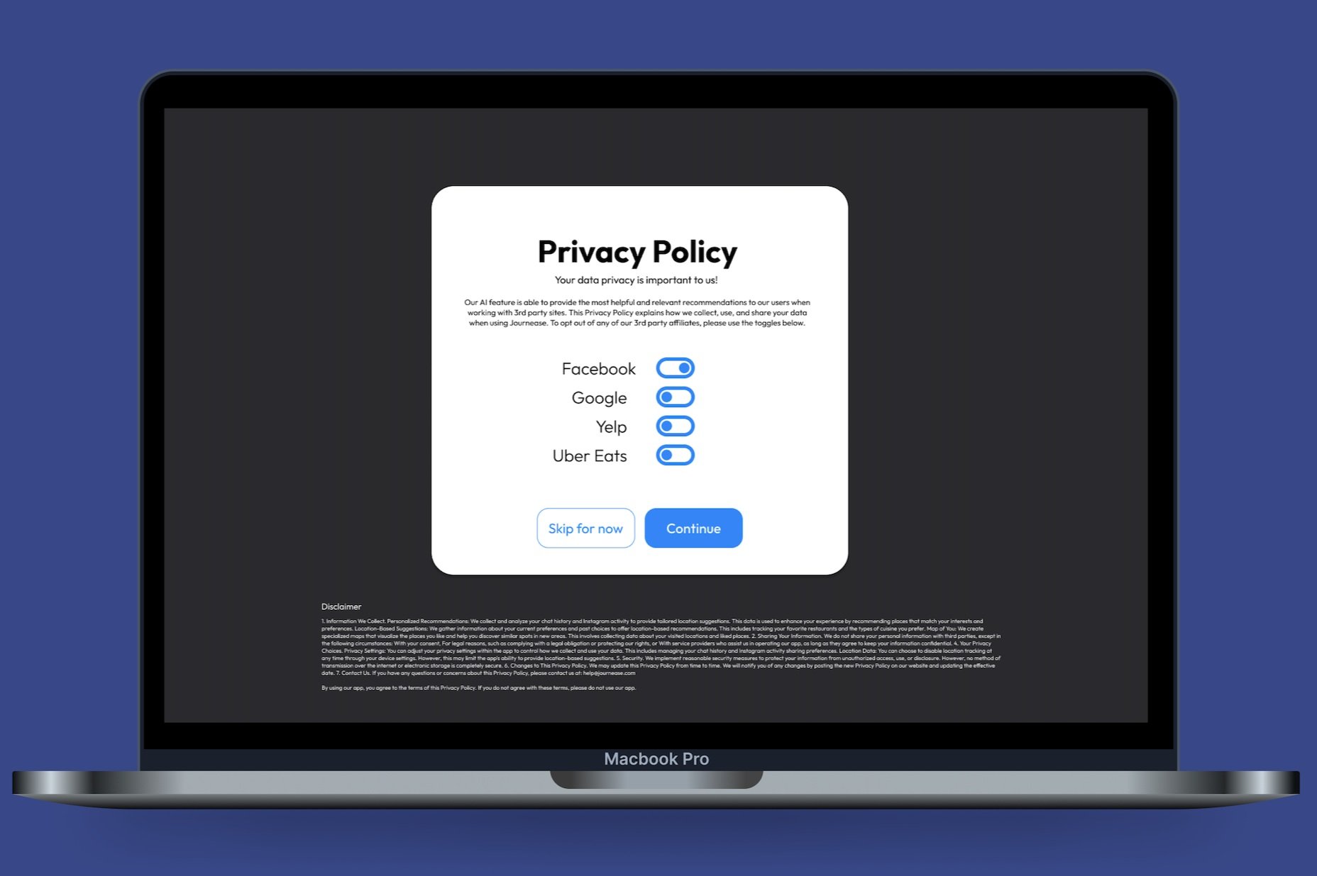
Personalized recommendations: Receive tailored location suggestions based on your chat history and social media activity. (Privacy Settings)
Location-based suggestions: Get recommendations for possible new locations based on your current preferences and past choices.
Map of you: Visualize the places you like and discover similar spots in new area. (Specialized Maps)
Project Goals
Before moving onto the next phase, we needed to narrow down our goals and get more specific. We compared our business goals with those of the users to come up with a handful of ideas that we could take with us into the next phase of the project.
Business Goals
Build a responsive, user-friendly website & mobile app
Leverage the power of AI for better & more accurate performance
Create features that encourage longer use on the platform
Encourage users to switch from other apps
Great web/mobile experience
Features that users want and work well
Privacy options
Location based recommendations
User Goals
Receive personalized suggestions reflecting current location
Allow for easy searches and saving for later use
Have an easy interface that is intuitive and easy to navigate
Privacy settings that make users feel comfortable
Information Architecture
Site Map
Lo Fi Wireframe Sketches
We began to think through the layout of our first pages and made decisions about how our content would be organized and displayed based on our project goals.
Prototype
Sketches to Prototype
Using the general design of the hand drawn wireframes, we built out digital lo fi wireframes.
This is the point in the project that I began to also focus on the mobile experience independently. I felt that it was important to include a mobile version of Journease because I think realistically users would be more likely to use a mobile app of this product, and I strongly felt like a mobile first experience was the best approach to this project.
Mobile Lo Fi Wireframes + Flow
Desktop Lo Fi Wireframes + Flow
Testing
Usability Study
After creating the lo fi prototypes we tested and modified our designs based on feedback from real users. We had four users participate in a remote, moderated study where we focused on how easily they could complete various tasks, we observed their feelings and thoughts while completing those tasks, and made notes of any areas of tension in order to improve overall designs.
Users were asked to complete tasks such as:
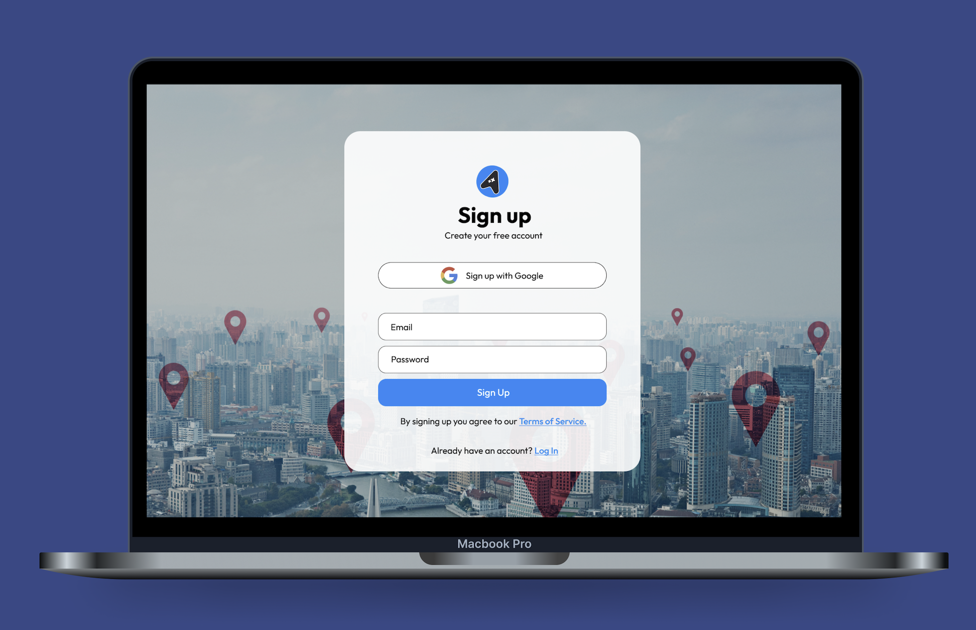
Sign Up and get to Dashboard successfully
Find ‘Saved’ items
Rate and review search results
Access ‘Favorite Routes’
Affinity Diagram
To organize my findings from testing, I compiled all my notes and observations into an affinity diagram. This process helped me better understand the patterns that emerged during testing and identify key areas where revisions should be prioritized to enhance the design’s usability.
Pain Points:
3/4 mentioned that there should be a menu or navigation bar
3/4 were confused by the features offered
2/4 did not like the amount of time needed for on boarding
2/4 felt that the dashboard was crowded with too many items
3/4 asked if the map view was interactive and could also be used
Insights:
People wanted a traditional menu or nav bar to move throughout the app
Most were not clear on all of the features available or felt there were missing opportunities
Some felt that the dashboard was cluttered and therefore not a great flow
Most people wanted to be able to use the map as an interactive option for searching
Half of users thought the on boarding process took too much time
Recommendations & Priority Revisions:
Add a static menu to the bottom of the app
Create more pages with clear features
Limit content on dashboard and instead put other features into menu or on other pages
Make the map clearly interactive
Hi Fi Mockups
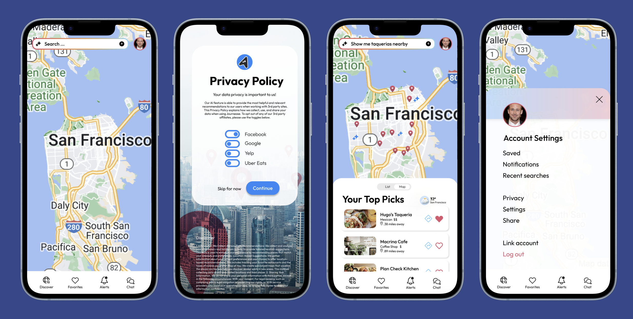
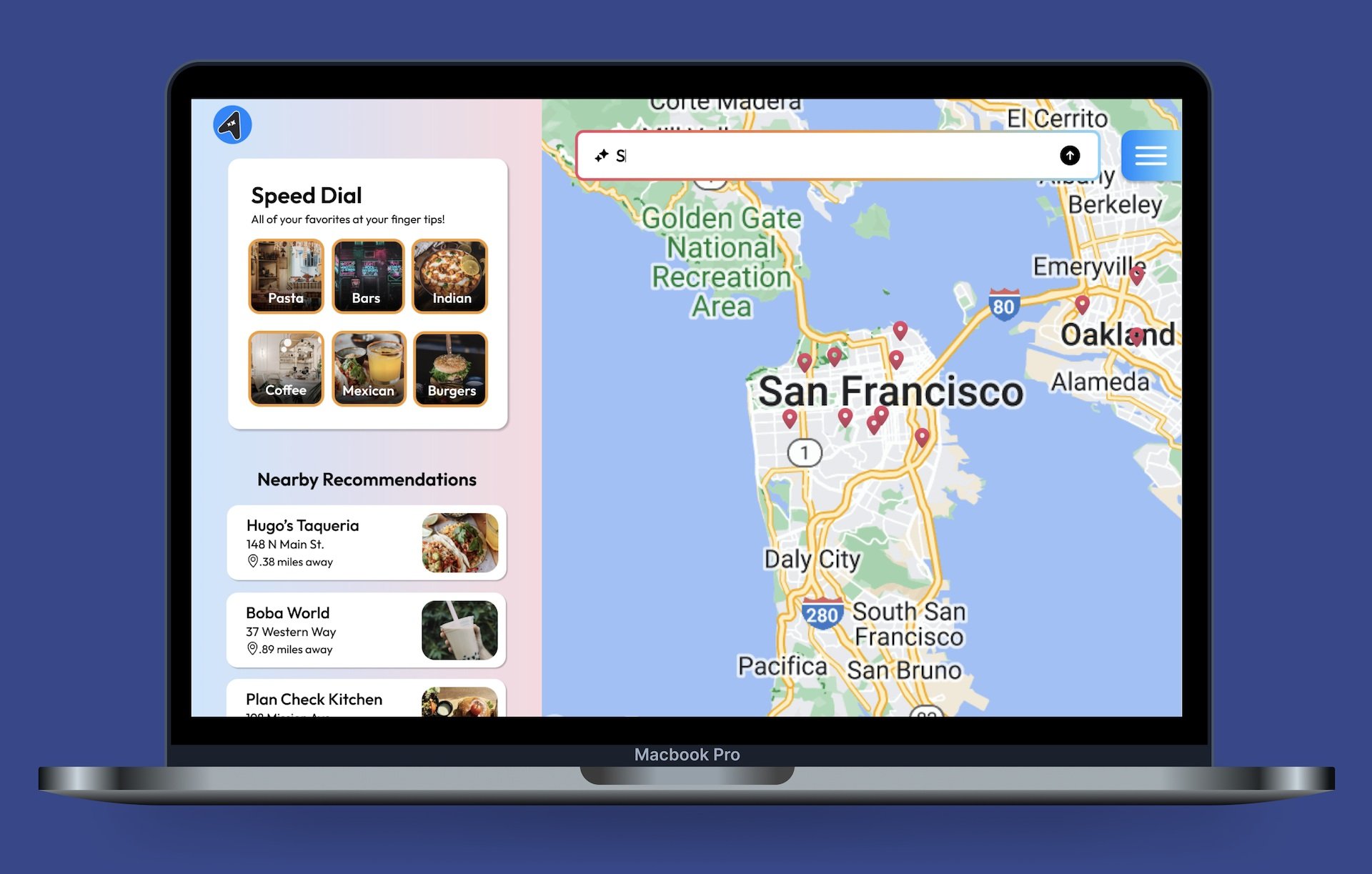
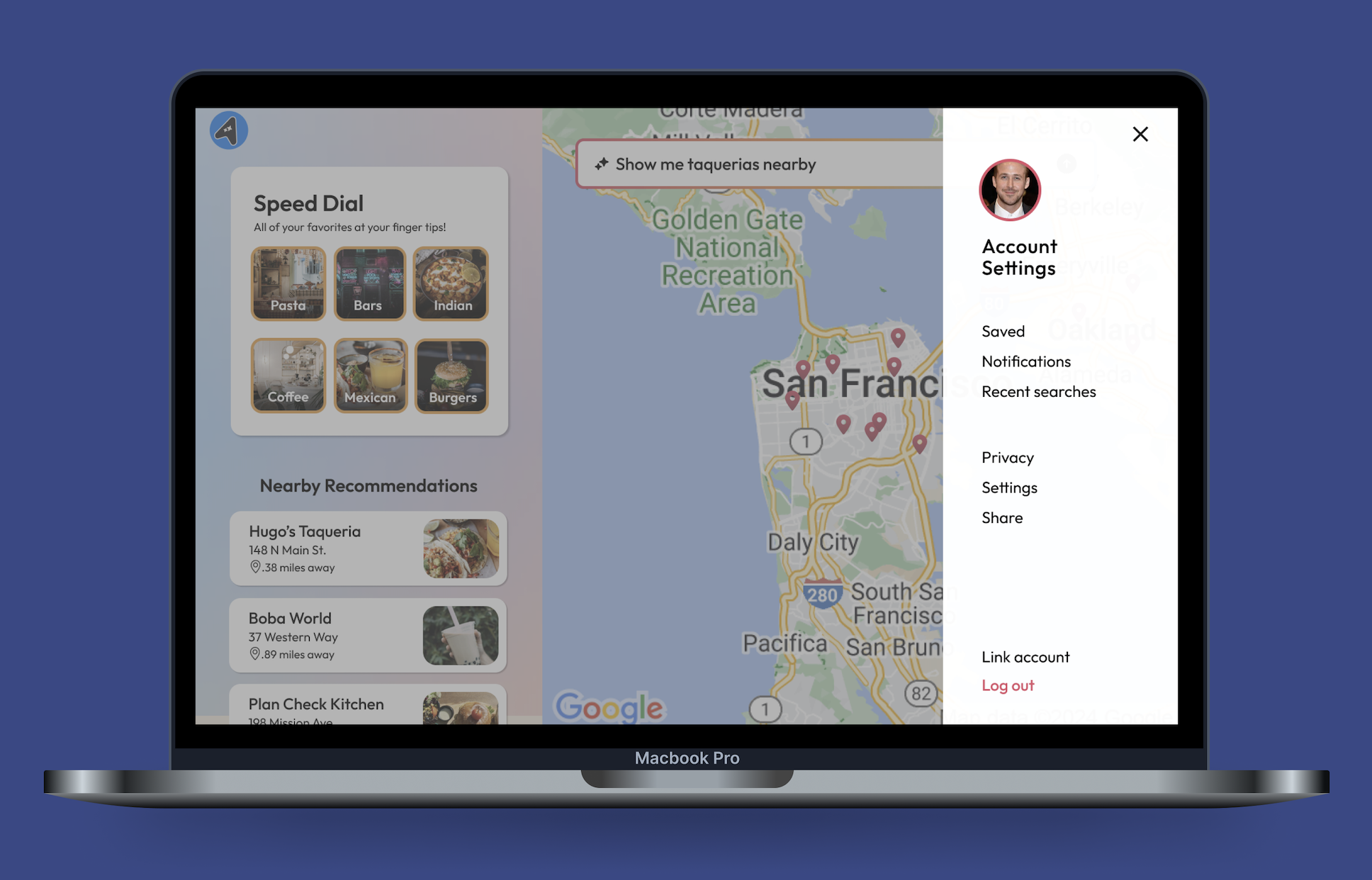
One of the biggest changes we made was adding a static navigation bar so users could more easily get around the app in a familiar way. I also decided to add a few new pages like ‘Favorites,’ ‘Notifications,’ and ‘Chat Buddy.’ I felt like these additions made the experience more interactive. Chat Buddy is another way the AI feature can really shine in Journease. Having a way to quickly text or speak with an AI companion will allow users to be very specific in what they’re looking for and receive the best results.
Lessons Learned
The research won’t be as helpful unless the goals are clearly defined
Our team lacked a well-defined problem statement and solution before starting the research phase, which led to many of our survey questions focusing on a feature that wasn't relevant to the project timeline for the Startup Weekend. While this data may be useful in the future, it created confusion for the product we were developing and ultimately resulted in some wasted time.
Challenges of working on a team
This was my first time collaborating with another designer, as well as a team of product managers and engineers. Initially, I took a step back to observe the workflow, but I quickly found my footing, contributing by asking thoughtful questions, addressing concerns, and engaging actively in the design process. The team was focused on building a website first due to the development team's capabilities. However, from a design and practical standpoint, I believe a mobile-first approach would have been more effective, aligning better with real-world usage.
How deadlines play into a project
Although the time constraint limited our research and creative exploration, it became an exciting challenge that pushed the design team to collaborate effectively and divide tasks efficiently. It also forced us to prioritize the most important elements, even when other great ideas emerged. Deadlines can create the necessary pressure to stay focused on the big picture, preventing us from getting bogged down in the details.
Next Steps
1. Re Test
We would do another round of testing to see how users respond to the changes made to the designs and the new features.
2. Hand Off
After final testing and changes were complete it would be time to hand off the designs to the developers to build the app.
3. Launch App
Once the app is built and complete we would then make it available on the market to real world users.
4. Additional Features
As the app was used by the public we would listen to user feedback and potentially integrate new features or make adjustments to current ones.


