UX Design
Netflix
Seamlessly integrating a new search feature
Empathize
Define
Ideate
Test
Prototype
Lessons Learned
Project Overview
Netflix is a leading powerhouse in the streaming industry, renowned for its brand recognition and innovative business model that keeps users coming back. However, even a successful company like Netflix encounters challenges and user dissatisfaction. In this project, my goal was to develop a creative solution to address a significant user frustration: the struggle to find the right program to watch.
Many Netflix users experience decision fatigue and frustration when searching for content due to the overwhelming number of choices available. They often spend excessive time browsing without finding options that align with their current mood, leading to dissatisfaction and abandoned searches. Despite advanced recommendation algorithms, Netflix does not fully address the emotional influence of content selection.
The Problem
Develop a mood-based recommendation feature that allows users to select content based on their current emotional state or preferences, with the aim of reducing browsing time and enhancing customer satisfaction.
The Solution
My Role
UX/UI DesignerUX ResearcherTimeline
4 WeeksTools
Figma, Figjam, Miro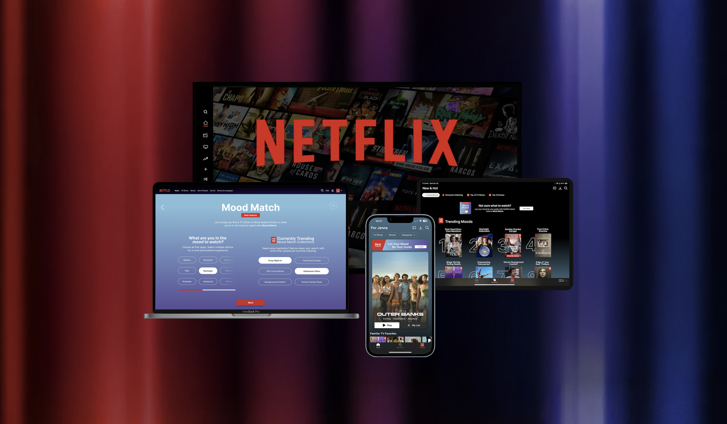
Design Thinking Process
Market Research
To better understand how streaming services recommend and showcase content to users, I began by conducting extensive market research using Google. This research helped fill gaps in my knowledge of industry trends and audience behavior, with a specific focus on how platforms curate and present content to their viewers. These insights were essential in guiding my design decisions for this project.
Here are some of the key findings:
Growing Importance of Personalization
91% of consumers are more likely to engage with brands that provide personalized recommendations (Accenture, 2022). As streaming platforms grow increasingly crowded, personalization is becoming a key factor in driving user satisfaction and retention.
Decision Fatigue in Streaming Services
44% of streaming service users spend more than 10 minutes searching for content, often feeling overwhelmed and frustrated by the abundance of options (Hub Entertainment Research, 2023). This highlights the challenge users face when navigating vast content libraries.
Emotional State Drives Content Choices
65% of viewers choose content based on their current emotional state or how they want to feel (PwC, 2021). Emotional context plays a significant role in media consumption, influencing users’ choices across genres and platforms.
Retention Challenges in Streaming Services
Easy content discovery is critical for keeping users engaged and preventing churn. A McKinsey study found that 35% of users will cancel a streaming service if they struggle to find content they want to watch.
Mood-Based Recommendations in Music Streaming
Spotify uses mood-based playlists such as "Chill Vibes" and "Feel Good Friday" to enhance user engagement. These features have proven successful in personalizing the music experience and keeping users more connected to the platform.
Market Demand for Innovative Discovery
The global streaming services market is projected to reach $330 billion by 2030 (Allied Market Research). Additionally, 55% of consumers are looking for new, innovative ways to interact with their content (Grand View Research), reflecting a demand for more personalized and intuitive discovery experiences.
A Failed Feature: “Surprise Me”
The "Surprise Me" feature on Netflix, launched in 2021, aimed to reduce decision fatigue by offering users a random show or movie based on their viewing habits. The goal was to make content discovery quicker and easier, especially for users overwhelmed by choices.
Lacked a strong personalization component
Often offering content that didn’t align with users' moods or immediate preferences
Viewers weren't looking for complete randomness but something that felt more tailored to their emotional state at the moment, leading to lower engagement and eventual discontinuation in early 2023.
Competitive Analysis
After gaining a deeper understanding of the streaming industry and its users, I analyzed some of Netflix’s biggest competitors. I examined both direct and indirect competition, focusing on their strengths and weaknesses to better understand how they recommend content and whether any of them use mood-based strategies.
User Surveys
My next step was to gather insights from real-world users. I recruited 8 participants for an online survey about their experiences with Netflix, ensuring a diverse pool to capture a well-rounded perspective. The survey included a mix of open-ended questions to encourage detailed responses, along with sliding scale and multiple-choice questions to quantify user feedback.
Some of the biggest takeaways were …
“There’s just too much content to sift through. Who has the time?”
“I’d like to see better choices based on things I’ve watched in the past.”
“It can feel overwhelming with too many choices when I’m feeling indecisive.”
“I want a more curated experience so I don’t waste so much time.”
100% said their experience on Netflix improves when they are recommended something that they enjoy
62.5% spend a minimum of 5 minutes looking for something to watch every time they use Netflix
87.5% of users have abandoned Netflix if they couldn’t find something that matched their interest/mood
50% often feel overwhelmed or frustrated when trying to find something to watch on Netflix
100% of users rely on Netflix's genre categories (i.e., thrillers, comedy, action) in some way to find things to watch
87.5% said that is is not easy to find something to watch on Netflix that fits a particular mood
Insights
Users feel like they are spending too much time searching for things to watch.
People get overwhelmed by the options available to them.
Most users depend on some form of guidance or structure to navigate through content and discover something to watch.
Users generally don’t feel like their Netflix account is personalized to them.
Needs
A quicker, more efficient way to find something to watch that fits their preferences, reducing the time spent searching.
To have content presented to them in a more manageable and personalized format.
Reliable tools or features that help them sift through the content, narrowing down choices based on their mood, preferences, or interests.
More personalized content suggestions that reflect their current emotional state, tastes, and viewing history.
All three research methods that I conducted provided really valuable insights and helped to reinforce my suspected problem statement and solution concept.
It was no surprise to learn that many users feel overwhelmed by the vast content on a streaming platform like Netflix, and they often abandon their search or switch platforms when they can't decide what to watch.
What did surprise me, however, was discovering that the music and meditation industries are leading the way in using mood-based strategies to tailor personalized recommendations.
Key Research Findings
Decision Fatigue and Overwhelm
Users face an overwhelming number of choices on Netflix, which leads to frustration and decision fatigue. The endless scrolling to find something that matches their current mood takes too long and reduces the enjoyment of the streaming experience.
Lack of Mood-Relevant Recommendations
Netflix’s existing recommendation algorithm primarily focuses on viewing history and genres, but it doesn’t factor in users' current emotional states. This results in users receiving suggestions that don't align with how they feel at the moment, which can lead to dissatisfaction.
Wasted Time Searching for Content
Users often spend an excessive amount of time browsing for something to watch without finding anything that meets their preferences. This can lead to abandoned searches or switching to other platforms, ultimately decreasing user engagement and loyalty to Netflix.
Empathy Map + User Persona
Using the information gathered during my research, I created an empathy map noting many feelings, thoughts, and quotes from my survey data. From there I created a user persona, Jamie, to help reflect my findings and represent who I will be designing for throughout the rest of my project.
POV Statement
After defining the my user persona as well as the key insights and needs from my research, I crafted POV statements to view the issues from Jamie’s perspective and developed HMW questions to brainstorm potential solutions.
Before moving onto the next phase, we needed to narrow down our goals and get more specific. We compared the business goals with the goals of the users to come up with a handful of ideas that we could take with us into the next phase of the project.
Project Goals
Business Goals
Increase user engagement
Reduce chances of platform abandonment
Increase user viewing time and retention
Boost costumer satisfaction and loyalty
Differentiate from competitors with new features
Leverage user data for better personalization
Reduce decision fatigue when searching for new content
More personalized recommendations
Increase viewing time
Improve overall satisfaction with the platform and brand loyalty
User Goals
Find content faster and more efficiently
More personalized and relevant recommendations
Feel valued and understood by the platform
Have an enjoyable and satisfying viewing experience
Avoid frustrations and annoyances when using the platform
Brainstorming
Crazy Eights
Although I was working on this project independently, I decided to do a Crazy Eights exercise to jumpstart my creativity and quickly generate multiple solutions to the project’s problem. I enjoy this method because it encourages out-of-the-box thinking and often reveals concepts I hadn't initially considered!
Problem Statement: Users spend too much time browsing Netflix and struggle to find content that aligns with their current mood, leading to frustration and, at times, abandoning the platform.
How might we help users discover content that fits their preferences quickly and efficiently?
Task Flow
User Flow
Prototype Design Process
Sketching Wireframes
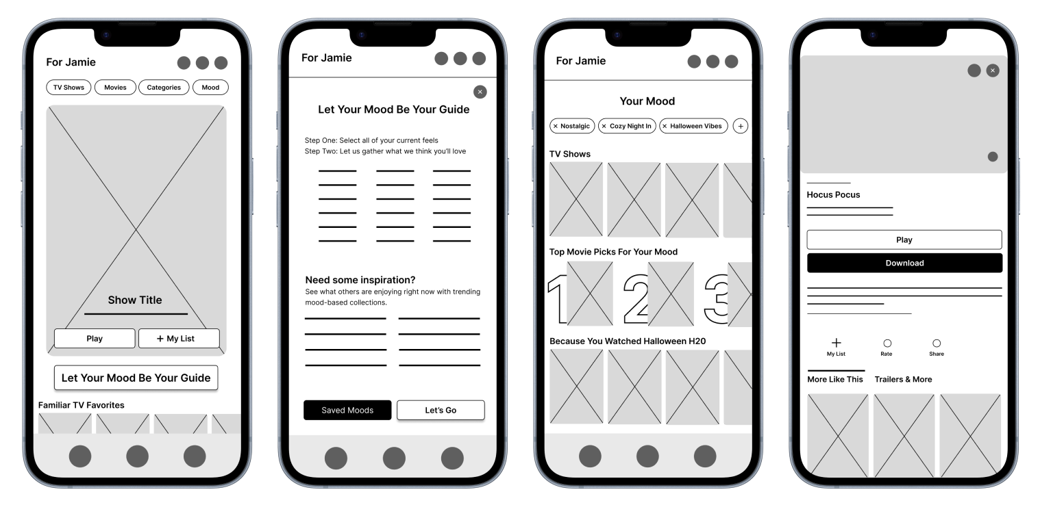
My primary focus was to create an engaging homepage experience that would encourage users to find and use the new mood-based recommendation feature in various ways. I decided to use pen and paper for my initial round of low-fidelity wireframes, allowing for a free flow of ideas and quick iterations. By the end of the sprint, I was pleased with several elements from each sketch and had identified the key features to incorporate into my digital wireframe mockups.
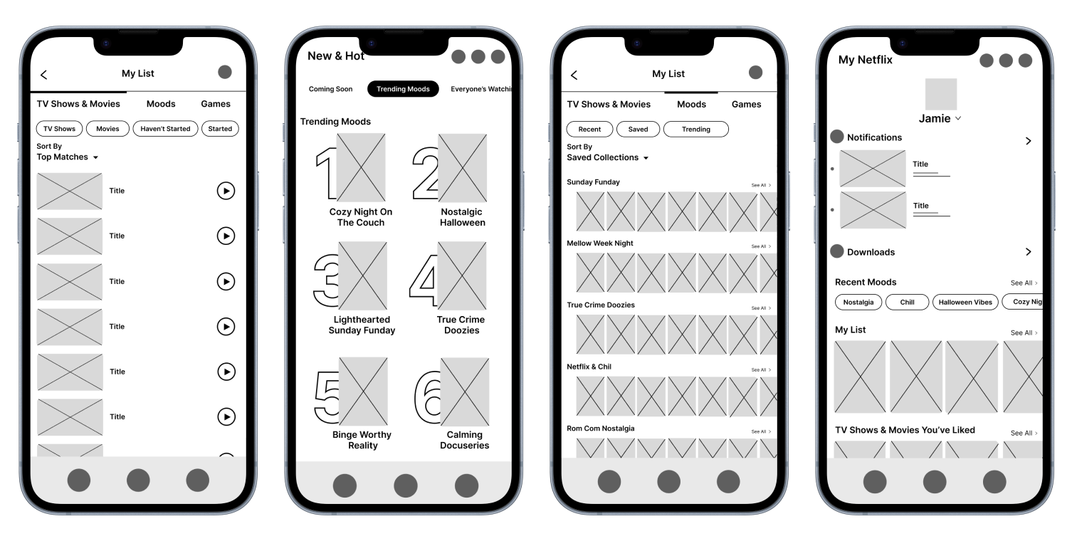
Digital Lo Fi Mockups
After refining the homepage layout, I shifted my focus to designing a few other key pages to ensure a seamless user task flow. My biggest breakthrough came when I developed the main interface for the new feature, carefully considering how users would engage with it.
Hi Fi Mockups
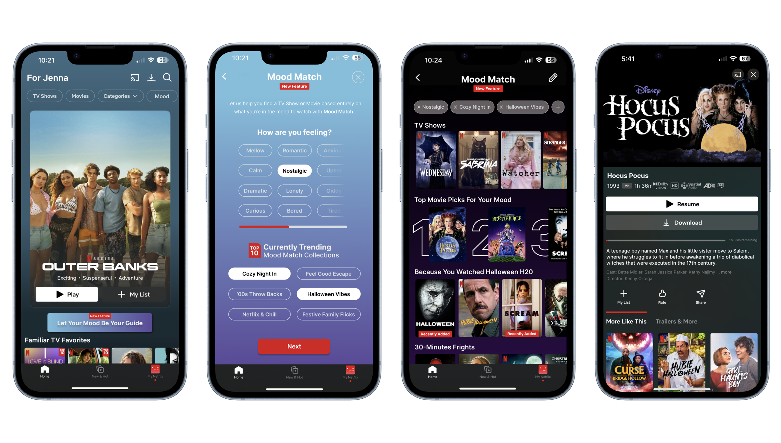
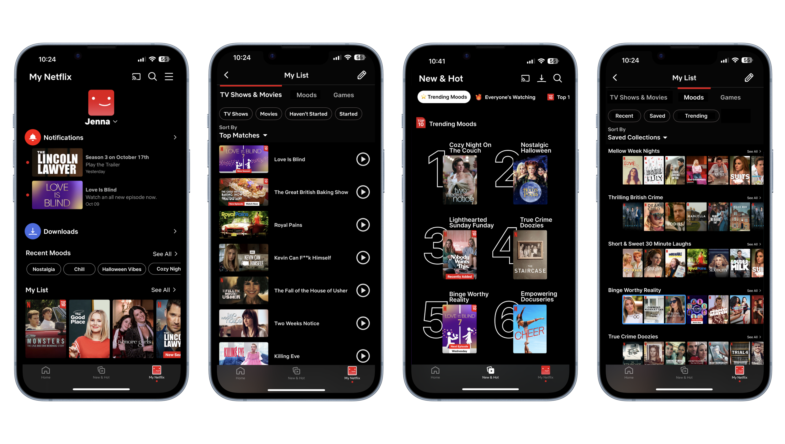
These are my first round of high-fidelity mockups. The biggest challenge was finding a way to seamlessly integrate a 'Mood' section into multiple existing pages within the Netflix interface. I also needed to create a clear, compelling introduction for users to try my new feature, Mood Match, while maintaining consistency with Netflix’s branding. To make this feature stand out, I used bold colors and emphasized it by labeling it as a ‘New Feature.’
User Testing
The next stage of my project focuses on user testing, which is a critical step in the design process. Testing will allow me to observe how real users interact with the prototype, providing essential insights into usability, user behavior, and potential pain points. By gathering direct feedback, I can identify what works well and what may need refinement during my final revisions, ensuring that the final product effectively addresses user needs.
(Usability Test Script & Questions)
Goals of the Usability Testing:
Evaluate Usability
Understanding if users can easily navigate and use the Mood Match feature is critical to ensuring the design is intuitive and functional.
Assess Discoverability
Testing how noticeable and appealing the Mood Match button is on the homepage will show if users are naturally drawn to it or if design adjustments are needed to increase its visibility and engagement.
Gauge User Satisfaction
Measuring user satisfaction will help me to know whether the feature enhances content browsing experience, helping determine if the Mood Match feature meets its primary goal of reducing decision fatigue and frustration.
Affinity Mapping
After completing the usability tests with 4 participants, I mapped out the key comments, thoughts, and feelings. I then determined there were 3 major categories and sorted the results accordingly so I could more easily understand what users were liking and what areas needed some work.
Wins:
The purpose and intention behind Mood Match was very clear and understood
The styling felt on brand with Netflix
Most users liked the copy, i.e. ‘Mood Match’ & ‘Let your mood be your guide’
Opportunities to Improve:
Button could be bigger and a few redesign adjustments
Add a Mood Match button to other pages for easy access
Instructions for Mood Match needs to be more clear
Priority Revisions
Homepage Button Design
One major user critique was the Mood Match button on the home page. There were multiple comments that the button looked like an ad or was overlooked in general. In order to solve this problem I made multiple changes to the design and moved the button to the top of the page.
Original
Updated
A few examples of my redesign process with button relocation, size, and style.
2. Adding a Mood Match Button to Other Pages
Another big mention was that users could only get to the Mood Match feature when on the home page. So I created a new and smaller version of the button to add to other pages. I also added a second way for users to find the feature while on the home page if they scrolled further down.
3. Including More Instructions for Mood Match
Half of users felt confused by the lack of direction for the Mood Match feature, so I chose to add instructions to help clarify and reduce any confusion.
Lessons Learned
& Next Steps
Designing a Feature for a Brand
This was my first time designing a feature within an established brand rather than building a product from scratch, and I found the process really rewarding. Working within an existing structure with established branding, colors, and design guidelines helped me move quickly and provided useful constraints. However, while these parameters were helpful, they also presented unique challenges, as they limited creative flexibility and required finding innovative ways to make the new feature feel both fresh and cohesive within the existing design framework.
Challenges With an Established Brand’s UI/UX
I decided to take a mobile-first approach to this project, as I anticipated that designing a new feature for a smaller screen would pose the greatest challenge. However, as I progressed, it became clear that Netflix's mobile UI/UX wasn’t as intuitive or familiar to users as I had assumed. This unfamiliarity emerged during usability testing, with users finding Netflix’s mobile layout and navigation challenging, likely due to their familiarity with the TV interface. As a result, the mobile app’s limitations diverted some focus from the new feature, impacting its visibility and effectiveness in testing.
Next Steps
The key to Mood Match's success would be capturing users' attention right on the homepage and encouraging them to engage with the feature to receive satisfying recommendations. My next steps involve further user testing to optimize the homepage button, including experimenting with its location, wording, and color scheme, to collect real-world feedback and ensure it resonates with users.


